Boosting Trial Sign-Ups with A/B Testing
In 2024, I worked on a project with a digital wellness company focused on helping users reduce screen time through their mobile app. My role in this project involved UX/UI design and conversion optimization. The goal was to improve the app’s trial sign-up rate by experimenting with new messaging strategies that would better resonate with users.
Goal
The primary objective was to increase the trial sign-up conversion rate. At the start of the project, only 7% of users who downloaded the app were signing up for a free trial. The company wanted to explore whether a more compelling message would motivate users to take action and engage more deeply with the app.
Design Process
Initial Research & Insights
To better understand user motivations, I conducted research into user behavior and psychological drivers that could influence decision-making. I found that many users were likely unaware of the long-term impact of their smartphone usage. This insight led me to focus on messaging that would emphasize the time saved over a lifetime by reducing screen time, creating a sense of urgency and value.
Creating the New Approach
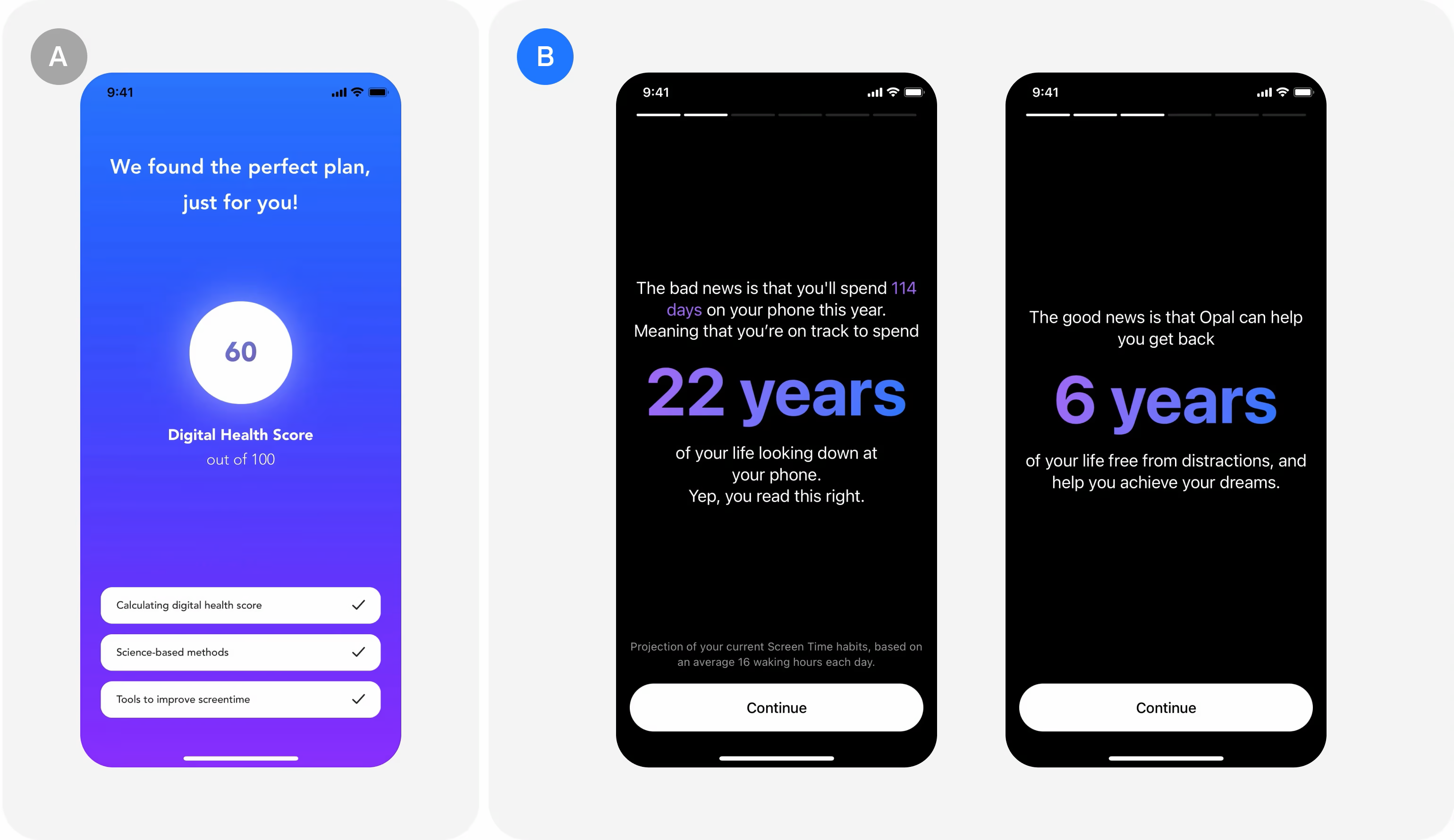
I developed a messaging strategy that projected the total time spent on smartphones over a lifetime. This message showed users how using the app could save them years of their life, tapping into the emotional and personal benefits of reducing screen time. This approach was designed to create a commitment effect—the same psychological trigger often seen in industries like fitness, where individuals are motivated to commit to long-term goals, such as signing up for gym memberships.
A/B Testing & Iterations
We tested this new messaging against the original approach, which focused more on the app’s general features and benefits. The A/B test was conducted over several weeks, and we iterated on the messaging based on user feedback and engagement data.
The key metrics I tracked were:
- Trial Sign-Up Conversion Rate
- User Engagement
- Product Interactions
The messaging was fine-tuned through multiple iterations to ensure it was clear, motivational, and actionable.
Challenges & Solutions
One challenge we faced was ensuring that the message didn’t come across as alarmist or overwhelming. I had to strike a balance between communicating the urgency of the problem (excessive screen time) and presenting the app as a positive, empowering solution.
Another hurdle was optimizing the messaging for different user segments. Younger users and older users responded to the message differently, so we adjusted the tone and framing to suit their varying priorities, testing different versions to identify the most effective approach for each group.
 Click to enlarge
Results
 Click to enlarge
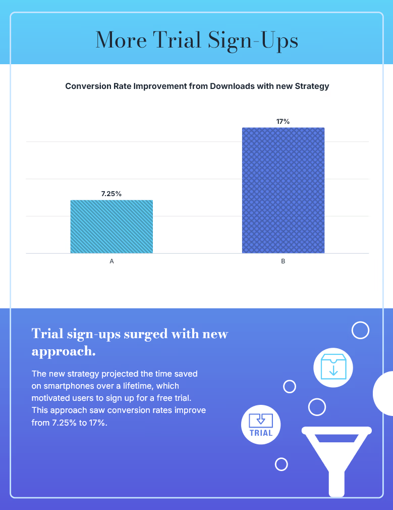
The results of the A/B test were significant. The new approach led to a 134% increase in trial sign-ups, with the conversion rate rising from 7.25% to 17%.
Key Improvements
| Metric | Old Approach | New Approach | Improvement |
|---|---|---|---|
| Trial Sign-Up Conversion Ratee | 7% | 17% | +10% |
| Number of Trial Sign-Ups | 700 | 1,700 | +1,000 |
| User Motivation | Low to moderate | High | Increased |
| Product Engagement | Low to moderate | High | Higher |
By focusing on the long-term benefits of using the app, I were able to create a sense of urgency and relevance that led to higher engagement and more trial sign-ups.
Key Learnings
- Emotionally driven messaging can significantly improve user engagement and conversion rates. Highlighting personal, long-term benefits, such as time saved, resonated deeply with users.
- The commitment effect, a psychological concept often used in industries like fitness, can be applied successfully to digital products to encourage action.
- Iterative design and testing are essential to refining a message that resonates with different user segments.
Final Thoughts
This project underscored the power of aligning product messaging with user psychology. By emphasizing the emotional value of the product and speaking to users' long-term goals, we achieved a significant increase in sign-ups and engagement. This case study highlights my ability to approach UX design and conversion optimization with a focus on user behavior, resulting in measurable business outcomes.